Posts

Web Design Principles

Image
^ link to example ^           I chose this first example because I feel that it has a very clean and composed appearance, and every color used is very complimentary. This example is some form of presentation for a product/website/application that is used to make traveling simple. I find that the display of a minimalist version of Google Maps displayed on a phone is a unique and effective way to approach this site, and the creators of this example have paid close attention to what makes a website visually appealing! The title, "Let's make a journey!" is also a wonderful choice for the designers to have chosen, as it fits the layout and topic well. This website's greatness is mostly due to its composed use of graphic design, as all of its images, colors and use of motion and text are what attract the viewer to the screen. ^ link to example ^      I chose this second example because I feel that it's appearance is very appealing in ...
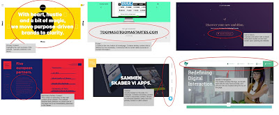
Exploring Website Elements

Image
Google Drawings Share Link: https://docs.google.com/drawings/d/1hOFmiy1eKpdzQrlW1puY9O9CekK2I3FpshlRphFIyoQ/edit?usp=sharing            For this assignment, I chose the examples that I did because they all show the many different forms that web pages can take on and how the elements are used effectively on everyday sites. When we use social media and the internet every day, we often don't take into consideration the different parts of a website that make it as convenient and well composed as they are. It is these elements that allow for simple navigation, and easily filters what we see to include only the necessary things. I feel that I chose effective examples of the six different elements because they all show the elements of different websites, meaning they can be compared to almost any site and the same concept would be understood for all other sites that follow these web design principles (which is most of them!).

Magazine Cover Assignment

Image
          For this assignment, we were to create our own magazine cover with our new understanding of design principles and how to use them to our benefit. For my magazine cover, I chose to use the topic of musical theatre. I chose this topic because I feel that it is what I care about the most and I would have the most ideas for creating it. Considering the design principles, I feel that I was able to capture most of them relatively well! For example, I created a balance in the magazine cover by positioning the main subject of the cover to one side of the image and left all of the text to the other side of the image. This allows for their to be a focus to the center of the image rather than a distraction on either side that is more appealing than the other.            I covered the design principle of Rhythm/Repetition with the use of symmetry on the cover. I used equal amounts of media on either side, with a full image ...

Understanding Design Principles

Image
Image from: nothingbutgeek.com Balance/Contrast This magazine features only one image as a main focus, the image of Carrie Fisher. This is balanced very well with her pose, and the text equally distributed on both sides of her. The image features a lot of contrast with it's use of a black and white focus of color. This allows for her to have an ethereal essence, and is very fitting for a tribute edition of this magazine. The main image in black and white of Carrie Fisher is also contrasted with the bold, bright yellow of the magazine title. This adds the focus to her as well as the name in equal measure. Her pose adds the most balance in the image because her hands are placed at equal positions on her shoulders on opposite sides of the image. Also, her straight-faced look and hair balances the image even more.  Rhythm/Repetition (Movement/Pattern) This image creates a sense of repetition and pattern in the sense that the main image is almost exactly symmetrica...

Photography Composition Techniques

Public Domain and Creative Commons

Pexels Pexels is an image hosting website that offers all kinds of high quality images in the public domain. They also offer images that licensed under the Creative Commons Zero License (CC0). Compared to most of the other sites of its kind that offer free images, Pexels offers photos that are of genuinely good quality and are clearly tagged and easy to search for. They offer pictures that many students would actually enjoy using for projects and other creations. This website is very effective in searching for images, and it offers a lot of high quality material that I can see myself using in the future.  Creative Commons The website Creative Commons is used as its own search engine for free commercially usable files, meaning they get their files from different sources depending on what type of file it is you are searching for. You can select where you want the file will be found on, like YouTube, Google Images, or SoundCloud. The website then offers results depending on...

Fair Dealing Situations

Case One: Research With the use of research under fair dealing, students may use any works, as well as make copies of any work. Although, this extent of use is allowed, no more than ten percent of the work can be copied for the use of research. Also, if the research is to be published for any reason, the works may not be included, and should instead be sourced because it may not always fall under fair dealing to include them. Case Two: Satire When it comes to using copyright-protected works for satirical purposes, students may communicate and/or reproduce in either paper or electronic form short excerpts from a work. However, the amount of work reproduced may not exceed ten percent of a given work, or the entirety of a poem or an entire artistic work. Case Three: Education With fair dealing in education, the rules are very lenient. It ranges from allowing ten percent to the entirety of work to be copied for educational purposes. It depends on what type of work it is as well a...