Posts

Showing posts from April, 2018

Web Design Principles

Image
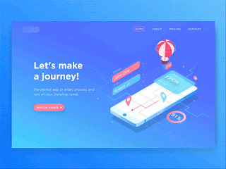
^ link to example ^           I chose this first example because I feel that it has a very clean and composed appearance, and every color used is very complimentary. This example is some form of presentation for a product/website/application that is used to make traveling simple. I find that the display of a minimalist version of Google Maps displayed on a phone is a unique and effective way to approach this site, and the creators of this example have paid close attention to what makes a website visually appealing! The title, "Let's make a journey!" is also a wonderful choice for the designers to have chosen, as it fits the layout and topic well. This website's greatness is mostly due to its composed use of graphic design, as all of its images, colors and use of motion and text are what attract the viewer to the screen. ^ link to example ^      I chose this second example because I feel that it's appearance is very appealing in that every color

Exploring Website Elements

Image
Google Drawings Share Link: https://docs.google.com/drawings/d/1hOFmiy1eKpdzQrlW1puY9O9CekK2I3FpshlRphFIyoQ/edit?usp=sharing            For this assignment, I chose the examples that I did because they all show the many different forms that web pages can take on and how the elements are used effectively on everyday sites. When we use social media and the internet every day, we often don't take into consideration the different parts of a website that make it as convenient and well composed as they are. It is these elements that allow for simple navigation, and easily filters what we see to include only the necessary things. I feel that I chose effective examples of the six different elements because they all show the elements of different websites, meaning they can be compared to almost any site and the same concept would be understood for all other sites that follow these web design principles (which is most of them!).